THE NEW IOS7
September 18, 2013
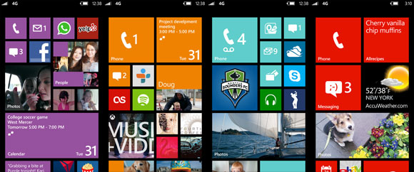
Flat graphics are the current trend in user interfaces. Windows Phone was the first to popularize the trend with their bold colors and simple graphics.
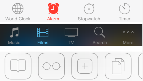
Now Apple is releasing iOS7 on September 18th with a new flatter interface. Its not as simple as Windows single color live tiles, instead they keep subtle gradients but have simplified the icons. 3D and realism are officially old school.
Here is a great visual comparison designed by @pawsupforu
Previously, iOS7 popularized skeumorphism, which mimics physical objects with textures, shadows and details so users instinctively understand how to use them. This helped users transition to touch-based devices.
Research has now suggested that they are able to simplify icons while maintaining the same level of comfort and ease-of-use for users.

Apple is continuing to use Helvetica Neue but have chosen to use the “Light” version of the font to complement the thin lines of the newly developed icons.
In the following months and years, many companies will mimic this trend that Apple is establishing in iOS7. Apple is always trying to minimalize and simplify their devices as much as they can get away with.


